Description
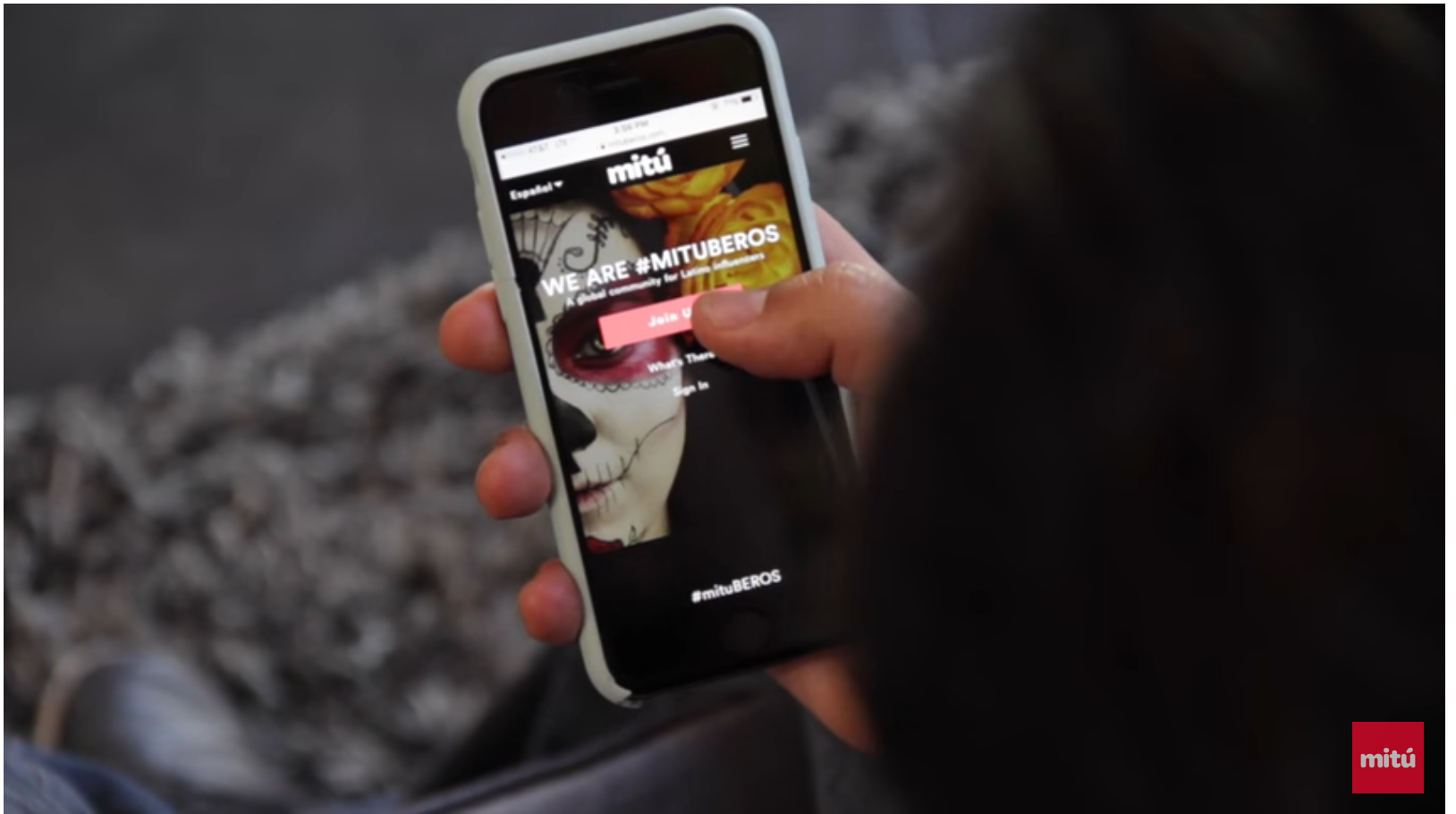
Create an influencer marketing platform to bridge the gap between top brand advertisers and mitú influencers. mituBEROS will provide quality campaigns for the influencers, offer optimal audience reach and awareness to the brand and turn a profit for mitú.
My role
Working as part of a five person team, my role was to lead the user experience and design for a conceptual influencer web and mobile app. I followed the process of discover, define, design, develop and deliver. I worked closely with the Product Team, CTO, Development and Analytics teams to produce mituBEROS.
The process:
Discovery phase – research
To begin the research, we started looking at competitors and interviewing influencers. We learned about what competitors offered, the demographics, and process. We then interviewed influencers to learn more about them and their needs, likes, struggles and thoughts of the marketing platforms and if they use them.
User interviews
We conducted user interviews with 10 Latinx influencers each having over 10,000 followers, stellar FB profile, excellent campaign performance and between the ages of 18-30. The analysis showed that we needed to design a system that was transparent, trustworthy, time efficient and provided instant gratification.
Competitive analysis
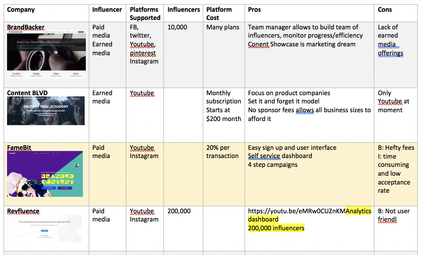
We researched the competition – 15 influencer marketing companies. The analysis showed that most of the platforms had very similar processes of content creation and payment. Three of the companies were determined to be our closest competition based on number of influencers, years in the business, and business model.
Experience mapping
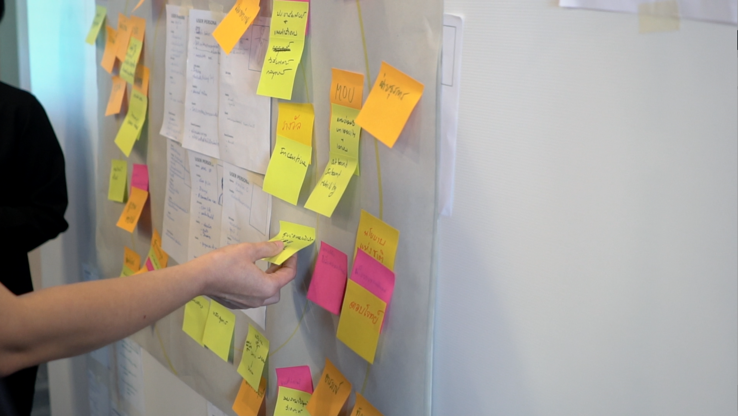
We wrote down quotes from influencer interviews and documented findings in our research on sticky notes. What we found was that the competitors were not aligning with the needs of many of the influencers on our platform. We were able to determine 3 key pain points and create goals to a better product for our users.
3 key pain points
Synthesizing our findings
Defining user personas
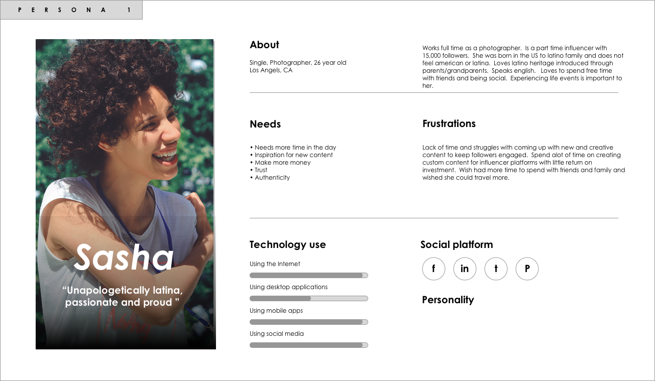
The main users of the influencer platform are between the ages of 18-30 years old and have at least 10,000 followers. They are from LA and have lived in the US their whole life. Their Latina/Latino heritage is still a very strong influence in their lives through their parents or grandparents. They prefer to speak English vs Spanish. Most work full time and being an influencer is their hobby or side hustle. They struggle with time and producing high volume high quality content all the time. They are competitive and do not normally want to collaborate with other influencers. They are very protective of their followers and their brand . Being authentic is mandatory and anything too commercial is rejected.
Define phase
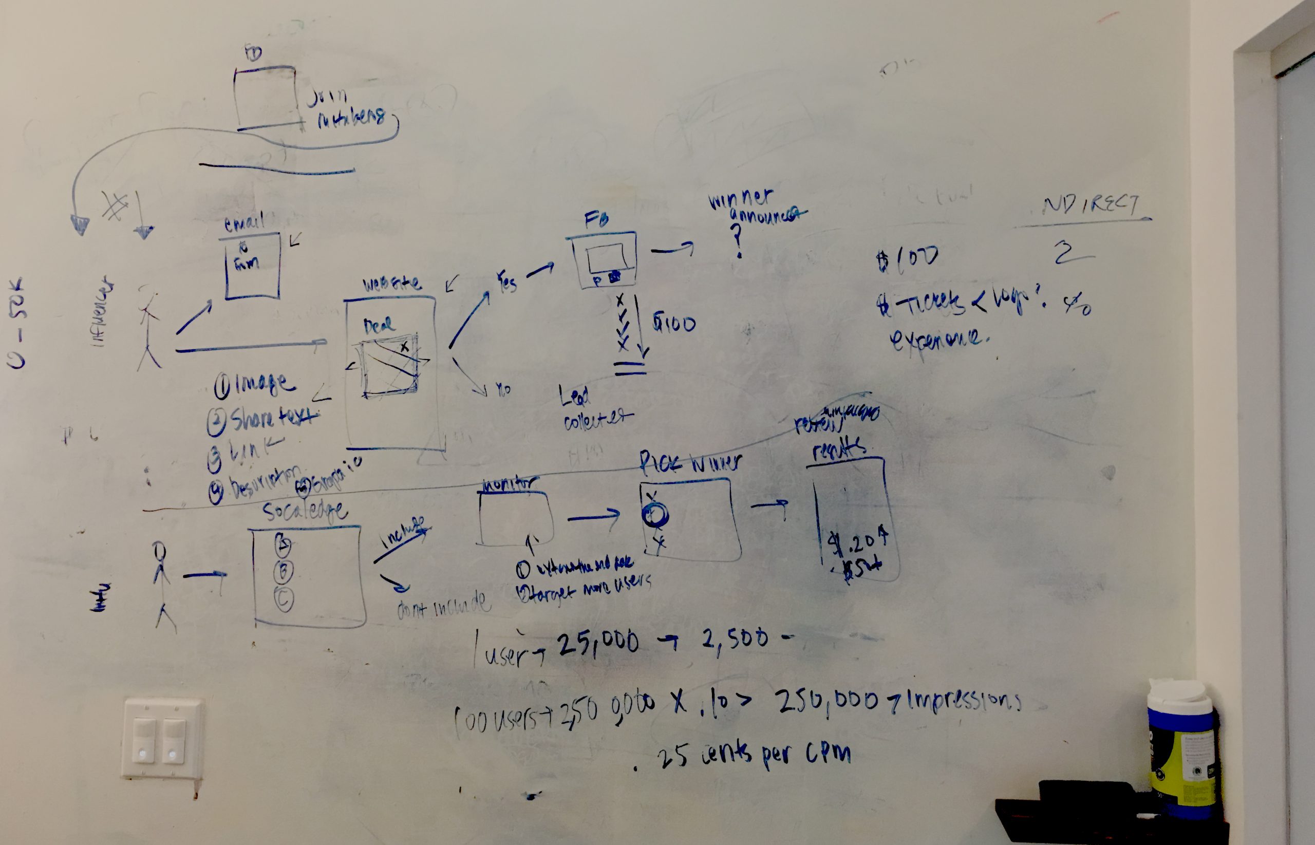
The team gathered and began brainstorming on the white board different scenarios that would meet the top three Goals of the user.
• Earned trust • Time efficient • Offers monetary value
Ideation
Together with the product team, development team, CTO and 2 influencers we brainstormed ideas on the whiteboard. We kept in mind ease of use, earning trust, and rewarding experience. We considered our competitors, their pros and cons and what we could do better to save influencers time, make it worth the effort and keep them coming back. We also sketched out ideas for the campaign managers and how the CMS for entering , sending and tracking campaigns would work.
Design phase
Once the architecture and user flow was thought out I started sketching and wireframing layouts and thinking about patterns for the screens.
Wireframes and mockups
Hand sketches on paper and low fidelity wireframes were first created before building and expanding on the mockups.
Designing mockups
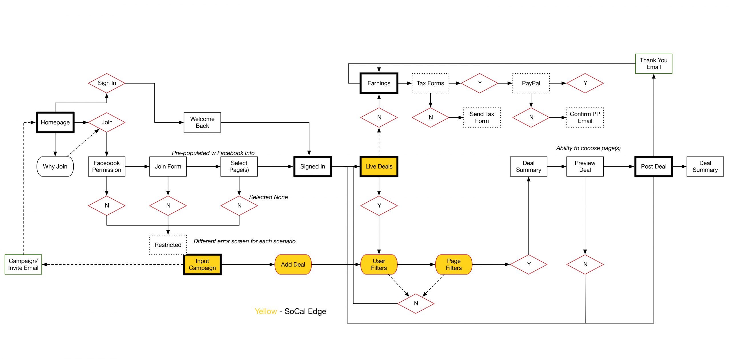
The new design of the influencer platform provides users with an easy 4 click on-boarding process, one click campaign process and auto payments every Friday.
1. Turnkey solution to connect influencers with leading brands looking to reach multicultural audiences (time)
2. Influencers are able to preview offers and content and choose only what they want to promote (trust)
3. Fast, easy and receive payment with a week. (monetary value high for time investment)
The look of the screens was to be loud, proud and authentic. Any design too polished appeared to be commercial and not authentic and did not appeal to them. The goal was to go with a DIY feel.
User Onboarding
The onboarding screens needed to fast and simple to be successful. We broke it down to four clicks and auto fill if using a social sign up. We chose to save the payments and tax form sign up at the payment phase.
Campaign interface
Influencers login to mituberos and are greeted with new campaigns. User can swipe through the campaigns and choose which they would like to participate in. They can view their accounts to see how much they have earned and when they have been paid as well as access and edit their profile settings. First time users will be promted to fill out their tax forms and Paypal information in order to be paid.
SoCal Edge - Campaign creators CMS
Campaign creators can create campaigns here in English and Spanish, choose the influencers whos brands are a match, set a price payout and schedule a time to schedule the campaigns to send.
User testing & refining
We built a prototype using InVision and had a group of 10 influencers use it and provide feedback before actual build.
We A/B tested headlines, titles, button text and images to see what produced the most clicks with Google Analytics and FB Analytics.
We added a customer service number and center (Zendesk) to the app to address any questions or issues the influencers encountered while using the app. This proved to be a great way to gather more direct data on users pain points and how we could iterate on the design to make the product better.
After a few months of the app being live, we interviewed a handful of users of the platform to get their feedback.
Results
The influencer platform was well received by the users and stakeholders.
The users reported the product was easy to use, took just minutes to participate in the campaigns, helped buy time by filling gaps in their content and were able to make some extra cash on the side. One criticism was that this app was good for making quick cash but was not going to make them rich.
The stakeholders were happy as the platform was producing an 80% profit.
Brands were also very pleased with the reach they were receiving and the return on their investment was quite a bit greater than their traditional methods and at a much lower cost.
profit
growth in 14 days
Next steps
-
- As a result of this experience and its success we will be initiating a mobile app design.
- Considering an option to donate earned funds to any charity of choice
- Adding Instagram to the platform
What I would do differently
As a result of this experience, I learned that not bringing in the sales team was a mistake. We missed the opportunity to understand their point of view and concerns and the platform was looked at as direct competition instead of an added benefit to them.
Testimonial
Startup work is not for the weak. Either you thrive under stress and own it, or you crumble under pressure. I have been fortunate to have worked with Jenniffer on lots of projects and count on her as a valuable team member. Jenniffer is an exceptional designer, with experience working with many types of applications and my first choice when it comes to any collaboration. Her extensive background in UI/UX made delivering projects a breeze. To only talk about her skills as a UI designer is a disservice to her and what she brings to the team. Since I started working alongside her, she has taken many roles within the organization. Jenniffer is as comfortable pushing out mock-ups as she is running a tech team. I have worked alongside her and under her leadership and always look forward to the next time our paths cross.
Alex Oatridge, Director of Engineering at MiTú Network


